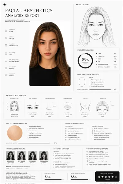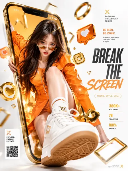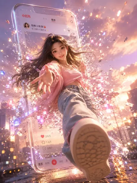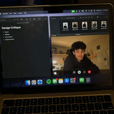
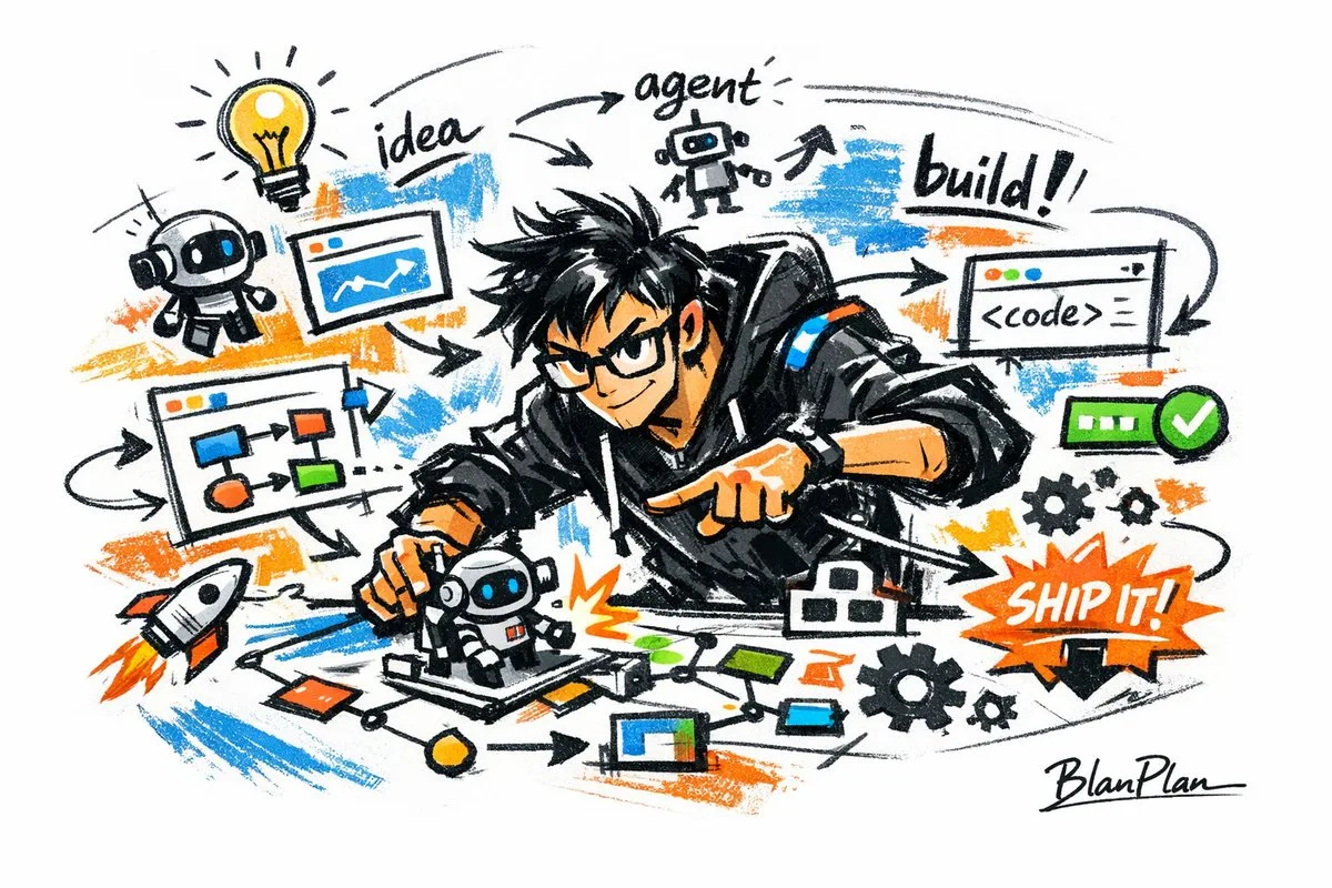
クリックで拡大表示 · 作例の参考イメージ
作例の出典
@blanplan ↗ · 作例 #42
オリジナルの作例内容を保持しています。生成結果はモデルのバージョン、参照画像、パラメータによって左右されます。本サイトでは個別の完全な再現を保証するものではありません。
UI・インターフェース / PROMPT #42
写実写真スタイル画像 · #42
画像を確認してからプロンプトをコピーしてください。プレースホルダーがある場合は、下部で内容を書き換えることができます。
01 / カスタマイズ
この作例には自動検出されたプレースホルダーはありません。コピー後、被写体・配色・テキスト・比率などを適宜変更してください。
02 / プロンプト全文 · 原文
Express {argument name="subject" default="a powerful AI builder"} in a graffiti sketch style, presenting an overall visual effect of quick outlines, free deformation, improvised hand-drawing, and draft-like sketches. The lines are casual, exaggerated, varying in thickness, and slightly messy but rhythmic and expressive, emphasizing generalization, exaggeration, fun, and spontaneity rather than rigorous realism or fine detail. The colors are expressed in rough blocks with a distinct dry-brush feel, retaining uneven smears, brush marks, fly-white, and layering. Colors automatically adapt to the {argument name="theme" default="powerful AI builder"}, but the overall expression remains graffiti-like, sketch-like, and generalized. No transparent watercolor smudging effects, no delicate watercolor transitions, no paper textures, no soft atomization, and no dreamy textures. The background is mainly white space, maintaining a sense of simplicity, ease, unfinishedness, and design. Small amounts of auxiliary symbols, arrows, marks, circles, repeated lines, handwritten text, or other graffiti elements can be added to enhance the sketchbook or essay-like visual language, but they should not be too crowded or destroy the subject and the white space atmosphere. The content of the picture does not need to be written in advance; {argument name="character image" default="a powerful AI builder"} will automatically deduce and generate the most suitable main image, actions, related elements, symbols, or simplified scenes. The overall style remains a unified graffiti sketch style and an exaggerated, generalized expression, avoiding complex realistic backgrounds and excessive detail. A special signature 'BlanPlan' should be naturally added as part of the picture, in a low-key but clear position such as the bottom left, bottom right, or near the title. The style should be unified with the overall layout, like an artist's signature or a design mark; the signature font should be exquisite, restrained, and high-end, not too large, and should not destroy the main composition or appear abrupt or cheap.お使いの画像生成ツールに貼り付けてご使用ください。本サイトはプロンプトの閲覧・編集ツールであり、画像の直接生成は行いません。
03 / 生成前のチェック
- プレースホルダーを具体的な内容に置き換え、参照画像が必要か確認します。
- 文字を含む場合はテキストを確定し、生成後に一文字ずつ確認します。
- 被写体、光、構図は一度に一箇所ずつ調整すると、効果を比較しやすくなります。
関連するインスピレーション
UI・インターフェースの他の作例