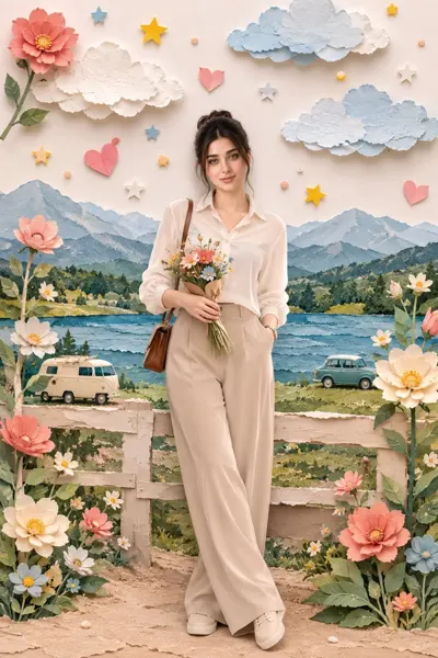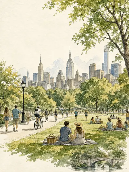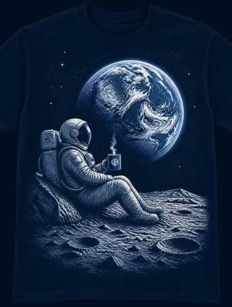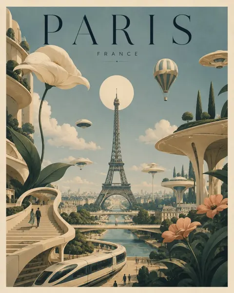
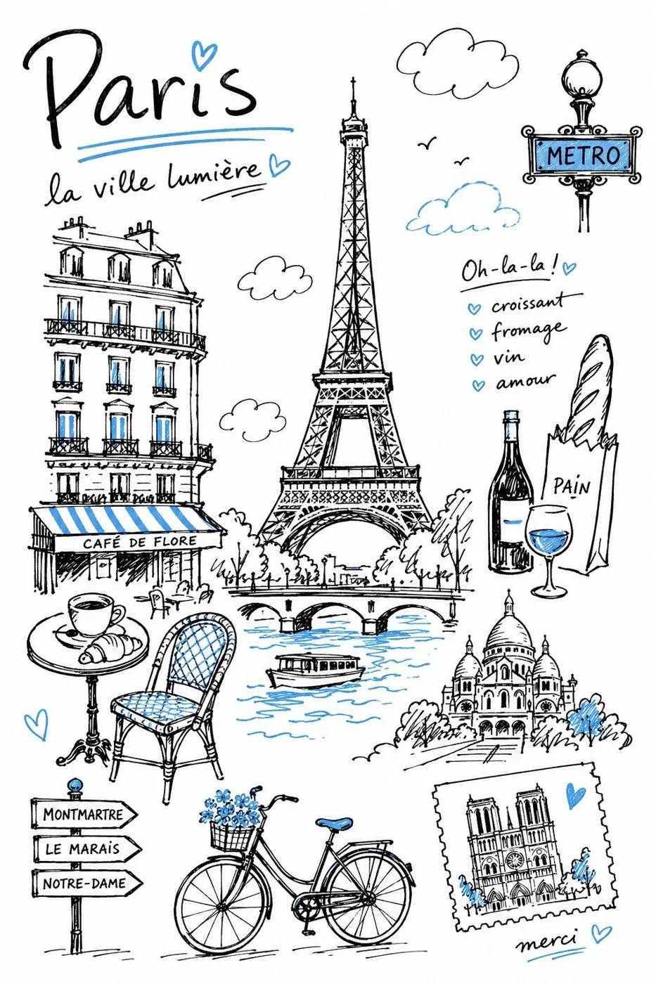
클릭하여 전체 이미지 보기 · 원본 사례 참조용
사례 출처
@Sairah_0 ↗ · 사례 #513
원본 사례 내용을 유지합니다. 생성 결과는 모델 버전, 참조 이미지 및 매개변수에 따라 달라질 수 있으며, 본 사이트에서 개별 검증을 진행하지 않아 동일한 결과의 재현을 보장하지 않습니다.
일러스트 및 아트 / PROMPT #513
단색 포인트 여행 다이어리 일러스트
먼저 이미지를 확인한 뒤 원본 프롬프트를 복사하세요. 치환 문구가 있는 경우 아래에서 원하는 내용으로 변경할 수 있습니다.
01 / 나만의 버전 설정
이 사례에는 명시적인 치환 문구가 없습니다. 복사 후 피사체, 색상, 텍스트, 비율을 직접 수정해 보세요.
02 / 전체 프롬프트 · 원문
Create a charming editorial travel illustration of {DESTINATION} in a simple hand-drawn doodled style, as if sketched by hand with a black felt-tip marker in a travel notebook. The illustration should feel personal, spontaneous, and imperfect rather than digitally designed. Think of the kind of drawing someone might casually create while sitting at a café after exploring the destination.** ## COLOR PALETTE Keep the illustration almost entirely black and white. Use **only one accent color: {ONE POINT COLOR}** ## STYLE Draw entirely with black felt-tip pen lines. Use slightly wobbly hand-drawn contours, natural line variation, loose marker strokes, sketch-like confidence, subtle imperfections, slightly open line endings, uneven hand pressure, and occasional overlapping strokes. Every line should clearly look handmade. Avoid perfectly smooth curves, mechanically precise outlines, polished vector graphics, or overly crisp digital rendering. ## SUBJECT Illustrate the unique atmosphere and instantly recognizable identity of **{DESTINATION}** rather than producing a realistic cityscape. Select the destination's most iconic landmarks, characteristic architecture, local transportation, famous scenery, native plants, local animals, regional food, and cultural objects. Focus on the spirit of the destination instead of literal accuracy. ## COMPOSITION Arrange the selected elements into a balanced editorial composition with generous white space. The layout should feel open, light, and effortless, similar to a designer's travel sketchbook. Allow objects to overlap naturally without becoming crowded. Every element should have room to breathe. Keep the composition visually relaxed and uncluttered. Apply the blue sparingly to selected details such as water, sky, windows, signs, clothing accents, decorative highlights, or small architectural features. Never introduce any additional colors. ## DRAWING STYLE Keep every object simple and intentionally simplified. Use flat shapes with minimal interior detail. Avoid realistic textures, gradients, shadows, painterly brushwork, glossy surfaces, or complex rendering. The illustration should remain clean, airy, understated, and highly graphic. ## LINE QUALITY The black marker lines are the main visual feature. Lines should feel confident, casual, lively, expressive, and naturally imperfect. Slightly uneven contours, open edges, variable line thickness, and small drawing inaccuracies are encouraged because they enhance the authentic hand-drawn feeling. ## MOOD Warm. Friendly. Relaxed. Playful. Minimal. Editorial. Contemporary. Elegant through simplicity. The finished artwork should resemble a beautifully designed travel notebook, boutique travel guide, editorial magazine illustration, or lifestyle sketchbook rather than a polished digital illustration. ## IMPORTANT No photorealism. No 3D rendering. No painterly effects. No gradients. No heavy shadows. No glossy lighting. No vector-clean artwork. No excessive detail. No busy composition. Preserve generous white space. Maintain a flat editorial doodle aesthetic with a distinctly handmade character. The final image should instantly evoke **{DESTINATION}** through simple, expressive black felt-tip sketches with subtle sky-blue accents.사용하시는 이미지 생성 도구에 붙여넣어 사용하세요. 본 사이트는 프롬프트 탐색 및 편집 기능만 제공하며 직접 이미지를 생성하지 않습니다.
03 / 생성 전 체크리스트
- 치환 문구를 구체적인 내용으로 바꾸고, 참조 이미지가 필요한지 확인하세요.
- 텍스트가 포함된 경우 원하는 문구를 명확히 지정하고, 생성 후 글자를 꼼꼼히 확인하세요.
- 효과를 쉽게 비교할 수 있도록 피사체, 조명, 구도 중 한 번에 하나씩만 수정하세요.
관련 영감 더 둘러보기
더 많은 일러스트 및 아트 사례